12 Tips to Improve The Average Time on Page & Make Visitors Stick Around A Bit Longer
We don’t know if the average time on page is correlated with the amount of money spent by online shoppers on their purchases. What we do know, however, is that consumers’ time is becoming scarcer, changing the way they shop online.
Basically, if a shopper leaves your website within the first seven seconds, you are in trouble.
In this blog post, we’ll touch on the most effective ways to increase the time spent on your eCommerce website and decrease exit rate.
Spoiler: Certain tactics may require some coding skills and/or a deeper understanding of users’ psychology. If you have trouble implementing any of the following techniques, feel free to reach out to our team. We are here to help.
What Is Average Time on Page?
Average time on page is the average amount of time that website visitors spend on a single page. Simply put, it’s the difference between the point when a user enters the page for the first time and the moment when they leave.
It’s important to differentiate average time on page and session duration, as these are two different metrics.
Session duration is defined as the entire time that visitors spend on a website, i.e. the sum of the time-on-page for all the pages that a user visits within a single session.
Average session duration is calculated by dividing the total amount of time spent on a website by the total amount of users.
Number of sessions per user is another important metric. Total number of sessions divided by the total number of users.
Now that we know the key metrics to track your time on site, let’s get down and dirty with some statistics.
Average Time Spent on Web Page: A Few Stats to Consider
A couple of years ago, the ‘data nerds’ from Finder revealed that roughly 140 million Americans spend around 1.7 hours a day shopping online at work. And while the figures are significant, it doesn’t reveal much about how that time is being spent or whether there is a correlation between time spent and money spent.
To understand the process in more detail, let’s take a look at some more data:
- According to Contentsquare 2021 Digital Experience Benchmarks report, the average time on page across industries is 62 seconds.
- As per LittleData, anything more than 1.6 is a good session duration. The total duration of 1.9 would put you in the 10% of the best-performing websites.
- The average session duration, according to DataBox research, is between 2-3 minutes.
Understanding the way your webstore performs over time will help you assess your position among competitors and (if you are, by any chance, lagging behind) optimize your strategy moving forward.
How do you track the time on page?
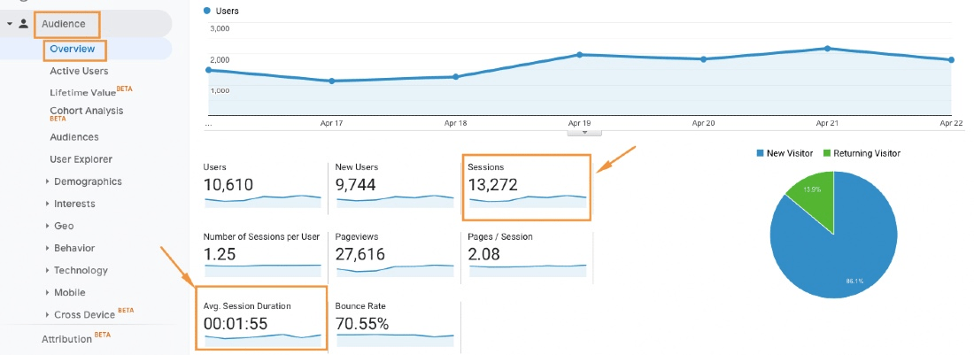
You can easily calculate the average time on page, session duration, and the number of sessions per user using Google Analytics.
Head over to Behavior —> Site Content —> All Pages to find information about the average time on page.

Click Audience —> Overview to get some valuable insights about your store’s average session duration and the number of sessions.
You can also take advantage of our Google Analytics addon that will allow you to track events happening on your site, including the ones related to eCommerce such as abandoned cart rate, checkout steps, and others.
(Learn more about Google Analytics enhanced eCommerce features in our step-by-step guide.)
Google Analytics app for X-Cart will give you rich insights into your website’s traffic and marketing effectiveness.
Price: Free
12 Tested Ways to Improve The Average Time on Page
Below you’ll discover a few tested steps business owners can take to optimize the time customers spend on their website.
1. Understand Your Buyers’ Intentions
Don’t get caught by a misconception that keeping visitors viewing your website longer is leading to a purchase. It’s vital to have an objective view of what your target audience wants from you.
Some people land on your site to make a quick purchase, others prefer reading your blog first. In both cases, your goal is to make this experience as efficient as possible.
To make the online shopping experience pleasurable or entertaining, create engaging content. It will keep your potential buyers browsing for longer and, who knows, they may even start coming back for more.
2. Map Your Customers’ Journey By Time
With a little bit more than a minute to make a sale, retailers need to know where that time is being spent. Obviously, the 62 seconds doesn’t apply to everyone, so firstly find out the average amount of time spent by YOUR visitors on YOUR website.
Once you have a clear picture of where your customers spend this time, you can evaluate this knowledge against your shoppers’ desired experience.
Ask yourself the following questions:
- Are the chunks of time throughout the customer journey times where customers read something valuable?
- Or are these moments of frustration where there are barriers to getting where they want to be next?
This process is likely to reveal some unexpected findings about your customer journey. You’ll see whether this current journey is reflective of what your customers really want or not.
3. Review Your Cart Abandonment Rates
Now it’s time to check your customer journey against behavioral data. You will be able to see whether the suspected points of friction are leading to site or cart abandonment.
The average cart abandonment rate varies somewhere between 60% and 80%. If yours is way higher, then there is a strong reason to improve your checkout process. A faster checkout flow should bring down this number.
4. Facilitate The Entire Checkout Process
The European children’s clothing retailer was losing 61% of purchases from the start of the checkout process. They addressed the issue by offering a faster checkout through Amazon Pay.
Amazon Pay addon for X-Cart lets shoppers sign into websites using their existing Amazon account information. They can then access all of their existing delivery and payment data easily and securely eliminating the need to re-enter the data.
Based on the reviews of our customers, enabling this payment option can shorten the checkout process by two thirds and increase sales by 15-20%.
I was extremely excited to have the ability to add the “Amazon Pay” module to our site. This feature is a must for small to medium businesses that want to grow as it not only provides security for the purchaser, but it speeds up the checkout process. Adding this feature immediately accounted for 15-20% of our sales.
5. Sprinkle Attention-Grabbers Throughout Your Website
Product videos and lifestyle photos showing the way customers use your products, catchy descriptions, chatbots… Well, any attention-grabbing element can increase the average time spent on site.
There’s no universal rule for adding such elements to your online store. To find the strategy that results in the increased time on page, you should always be testing.
Luckily, Google Analytics allows for tracking the events like video plays or chat interactions, which means you’ll be able to see which element is performing well enough and which one is to be scrapped.
6. Improve Your Website Performance
It’s not a secret that slow website performance is among the most common pitfalls of higher bounce rates. Having an online store that loads longer than a few seconds is like waving ‘goodbye’ to your potential shoppers the moment you see them from afar.
Chances are you already know a few performance optimization strategies that can help fix the issue.
Compress images? Good idea. Employ Gzip compression? Yes, ma’am. Anything else?
We have 17 more ideas (+ a nice infographic!) on how to speed up your site’s performance.
Need Help Improving Your Store’s Performance?
7. Optimize for Mobile and Other Devices
Make sure your store supports mobile beautifully. Given that more than 90% of the internet population uses mobile to go online, having a mobile-ready website is a must.
It’s important to optimize your store for various browsers. If your landing pages look perfectly in Safari, check Opera, Firefox, Chrome, Microsoft Edge, and IE — the layout may look differently in each browser.
8. Boost Sales by Showing Related Products
Your product page shouldn’t be your dead-end page. If a product doesn’t fit users criteria, they should have quick access to the related products of the same category.
If anyone knows how to create user-friendly eCommerce experiences, it must be Amazon. Related items, sponsored products, Amazon Posts, recently viewed products, the ones related to the items you viewed, and even more items to consider — these links may not increase the time on page, but your exit rates should be reduced significantly.
9. Design Your Store Wisely
Leverage the psychological aspects of user behavior and apply this knowledge to your store’s design. To put it simply, online stores that look good perform better than those that look cumbersome.
Make sure your home screen and product pages have enough of the white space, and your website visitors have an opportunity to browse without any distractors.
10. Establish Credibility
Whether this be your checkout, product, or blog page, it’s important to reassure your buyers and prompt them to browse further. This can be done in many different formats:
- Reviews. Back up your content with social proof — 84% of people trust online reviews as much as friends.
- Logo walls. Referencing the most popular brands that you’ve been working with could be a go-to strategy.
- Case studies. No comments.
- Showcasing awards is always a winning idea.
- Staff bios show that there’s a real person behind your brand, not a piece of artificial intelligence that will pop up every now and then asking irrelevant questions.
11. Tap into Personalization
Have you seen HubSpot’s Smart Content feature yet? What about Pardot’s Dynamic Content? This is how you can personalize your marketing assets such as emails, landing pages, forms, and your website as a whole.
The goal is to show relevant content to users based on their sales cycle, location, referral source, device type, language, and the like.
Here at X-Cart, we are on the verge of implementing this relatively new technology.
12. Improve Readability
Readability is king, when it comes to your blog or any other page where content is in the limelight. With a wealth of information available on the web about the way to write damn good copy, generating boring brand-focused content no longer cuts it.
You have to learn to educate as well as entertain your blog visitors through storytelling and other copywriting hacks. Check out our content marketing guide featuring some of the latest trends that have emerged full-blown in the post-COVID-19 era.
Conclusion
To optimize your website’s average time on page, it’s important to look at the way your shoppers interact with your brand at each stage of the funnel. Do your best to understand how your customers judge the time they are spending with you and how that changes throughout the shopping journey.
This will give you an opportunity to give your customers what they are looking for at the moment they need:
- Show some related content when they are ready to dwell on your website a little longer.
- Remove barriers on the way to checkout when they are in a hurry.
- Anything else?
The eCommerce businesses that recognize the value of customers’ time and use it effectively for mutual benefit will be the ones that customers gravitate towards and stay loyal to.
Are there any other strategies that can help increase customers’ average time on page? Have you tried any? Please share your experience with us.
About the author


