Order Confirmation Email: 20 Templates and Examples To Use Today
Order confirmation emails are sent right after a customer places an order on your company’s website, and they have mind-blowing open rates.
According to Omnisend, an average receipt email has an open rate of around 60%, which is 4x higher than that of any regular promotional email.
Why are these messages so powerful? Because they contain transactional details, such as order numbers, tracking info, shipping details, and other things that are important to your customer.
In this blog post, you’ll discover how eCommerce behemoths, like Nordstrom, REI, and TOMS, optimize their confirmation messages to generate additional revenue and boost conversion rates.
Read on, take notes, and feel free to steal some of the best templates for your eCommerce business.
Turn First-Time Buyers Into Loyal Customers With Confirmation Emails
With the right tools at hand, converting customers is easier than ever. Create an online store with X-Cart to get access to the best email marketing apps.
Do you know that customers who made a purchase once are likely to come back and do it again?
It’s true: returning customers usually spend 67% more than those who are new to your eCommerce business. That said, your order confirmations can be an excellent place to promote peanut butter when someone buys jelly, and encourage future purchases in your online store.
Let’s take a look at some of the great examples of order confirmation emails that you should send to update your customers on the order process. I hope they will inspire you to take a closer look at your email marketing strategy and rewrite your confirmation emails to make them shine
1. Solestruck Gives Clear Instructions on the Next Steps
‘OK. What’s next?’ — The answer to this question is what your customers expect to find inside your order confirmation email.
Even if you include customer history, payment information, and other order details into your transaction email, your customer may still have questions about the next steps.
This won’t be an issue if you order a pair of boots at SoleStruck.
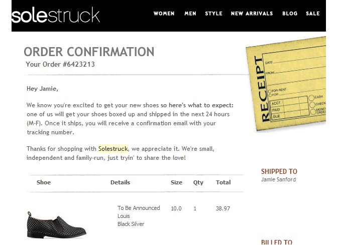
The copywriter behind this confirmation email immediately took the stress out of the user journey, explaining that the item will be packed and shipped within a day. They also include a tracking number to let shoppers keep an eye on their package.
You can also show tracking information right on your storefront.
With the Order Status addon for X-Cart, customers do not have to be logged in or have an account to track their shipment.
Price: $45
2. Crate&Barrel and Backcountry Promote Related Products and Brands
Your receipt email is the holy grail of further promotion.
You’ll hardly be able to impress your customers with some hackneyed promo emails, that’s the fact. However, you can naturally promote recommended products and other related stuff right in your order confirmation emails.
Your customers feel excited at the moment of purchase, so don’t be afraid to make the most of this excitement.
Here are a few things you should take into account:
- People are more inclined to accept your cross-sell or upsell offer if you follow up with them shortly after the purchase;
- Bombarding your clients with emails several times a day is considered to be rude and will only push them away;
- Products you upsell should be within 25% of the price of the original offer.
Crate&Barrel, for example, is never shy about adding personalized recommendations into their receipt notifications. Take a look at their order confirmation message below:
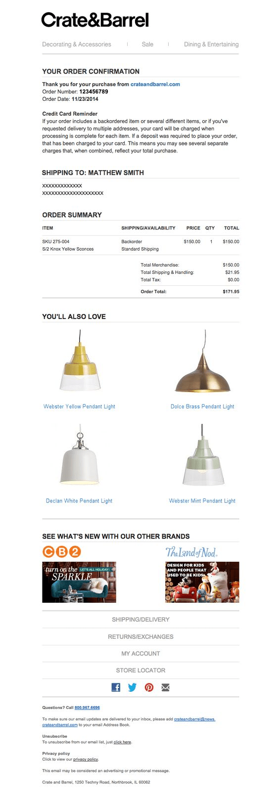
The “You’ll Also Love” section points out complimentary products to the original purchase. They even mention their sister brands, like CB2 and The Land of Nod. Who knows, customers may also be looking for quality baby and kids furniture.
Now take your look at the purchase confirmation email sent by Backcountry, an eCommerce company selling clothing and outdoor recreation gear. No, your eyes are not playing tricks on you. They promote their partners.
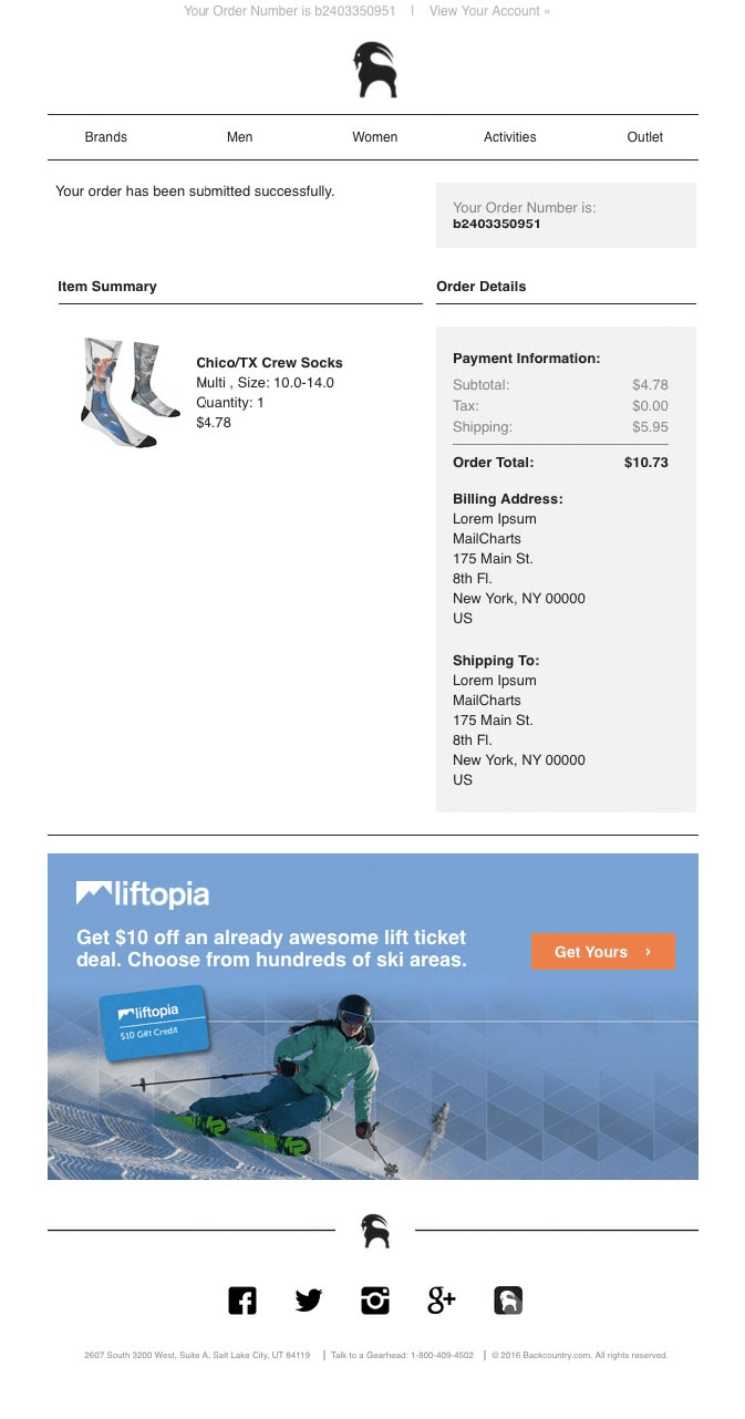
Well, why not? Here at X-Cart, we have a handy app that can help you launch a single-tier partnership program, profitable both for you and your buyers.
Partner Program addon for X-Cart allows your long-term buyers or partners to recommend your store to their friends.
Price: $249.99
3. B&Q Goes Interactive
The eCommerce world is never static. Every day marketers generate ideas, introduce new concepts, and alter the existing ones, and your emails should be no exception. Don’t be afraid to try something unconventional, creating your next order confirmation email.
Creative design and branding will grab your users’ attention and uplevel your transactional emails.
Take a look at this awesome interactive email from B&Q:
Animated images and interactive elements inject life into email campaigns and increase click rates.
This unusual customer engagement strategy is somewhat new, and animated elements are still not supported by all email clients. However, proper formatting will reduce the likelihood of your emails landing in the spam folder.
With Opayo tool for X-Cart, you’ll be able to customize the look and feel of your email confirmations as well as payment pages, error pages, etc. to match your website style, colors, and logo.
Price: Free
4. Chewy Animates Their Order Confirmation Messages
Adding videos and animation into order confirmation emails is a perfect way to deliver a fresh element to your customers’ inboxes. Animated elements will spice up your order confirmation emails and create a long-lasting impression.
The best part? You do not necessarily have to hire a designer and create all the videos from scratch. GIFs are an easy way of adding something fun to your campaign. Plus, GIFs are best at expressing emotions.
Have a look at this sweet monkey. We all know how it feels when things go wrong, huh?
Using Animated Eye-Catcher Effects For Email Designs:
- One GIF is more than enough. Less is more. Ideally, you want to have only one point of focus in your email.
- Use value-added content. Order confirmation emails are a bit more than just an entertaining piece of content. Your main goal is to display all the relevant information about the order.
- Code your emails for any device. Many email clients still do not support HTML and CSS, which means your transactional email may be broken for some of your users or sent to your recipient’s spam folder.
The bravest marketers add animated backgrounds in their transactional emails. This is not something that every eCommerce company does, but it can significantly improve brand impression and conversion rates.
Here at X-Cart, we’ve never tried sending fully-animated emails. We are convinced that order confirmation emails are primarily about delivering value, so nothing should distract users too much. Still, we encourage product videos on landing pages, homepages, and checkouts. There are a few handy tools for that:
Product Video addon adds video content to your product pages, giving you the opportunity to showcase your products in motion.
Price: $19
Video & Content Testimonial addon for X-Cart will allow customers to record video testimonials about your brand and products.
Price: $29.99

Indi Engagement Cloud addon will add UGC video to your X-Cart eCommerce store to increase conversion by up to 80%!
Price: Free
Now let’s have a look at Chewy, a Florida-based online store for pet products.
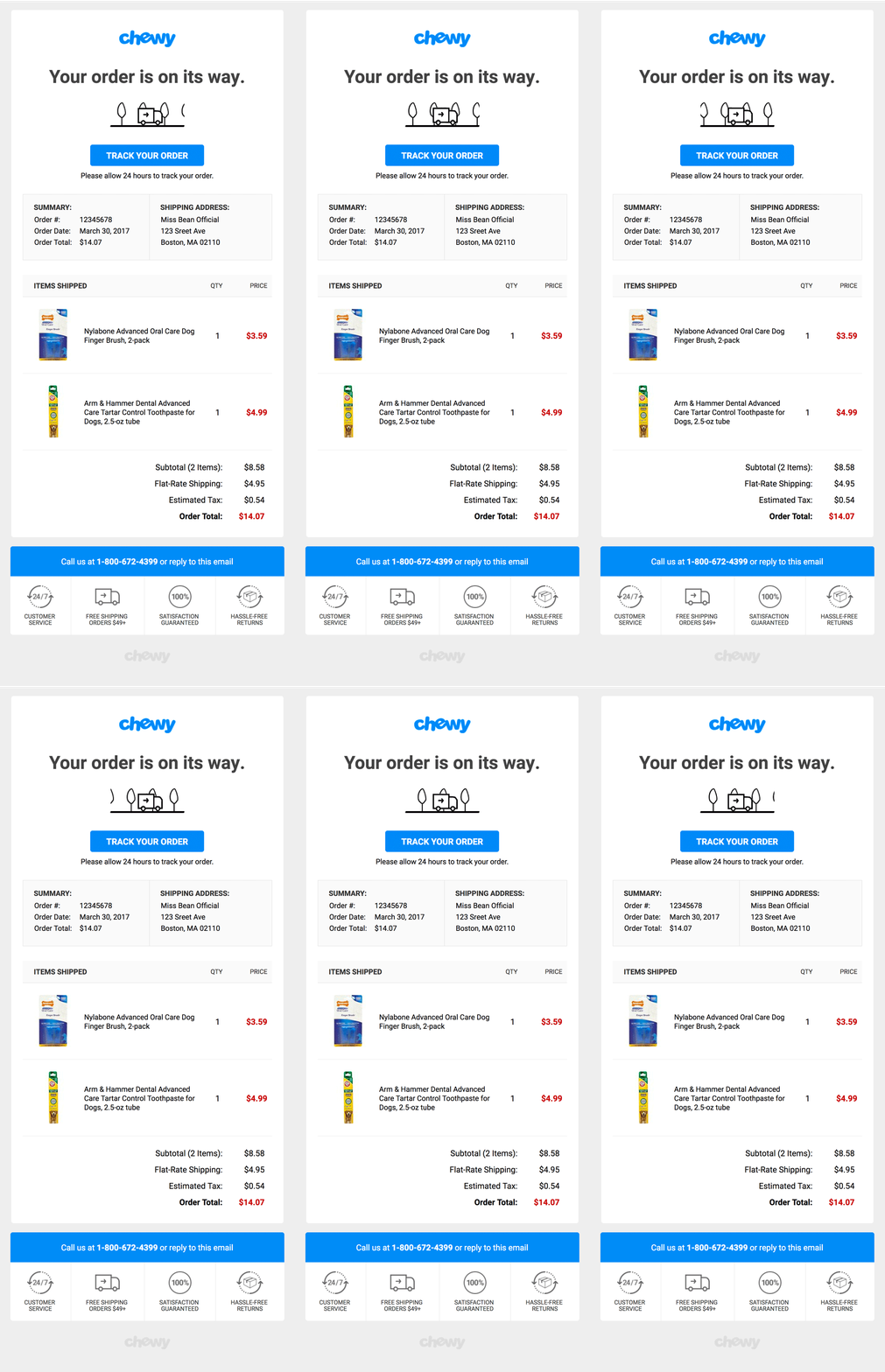
They do not go heavy on animated elements. There you can see just a small truck transporting orders to customers’ doorstep — good stuff without the fluff.
5. Cinetech Generates UGC by Asking Users to Show Off Their New Home Cinemas
User-generated content (UGC) is a way for customers to share their experience with your products. It is a perfect brand-builder, and it may come in various forms: video, images, reviews, and more. On Amazon, for instance, customer reviews fuel rankings in search results. This type of UGC makes or breaks a customer’s opinion of your product.
Using UGC In Your Confirmation Emails:
- Encourage customers to share their feedback on social media by adding a call to action in your order confirmation email. Remind them to include images of your products with a hashtag, so that you could easily find their publications.
- User-generated content displayed inside your confirmation emails boosts customer retention. While the primary message of your email is transactional, UGC can stimulate future purchases.
- Use customer testimonials legally. Ensure that you get the appropriate permission from your shoppers before using their reviews for email marketing.
Asking your customers to share their feedback on social media right after the purchase is way more efficient than simply coaxing them to join your Facebook group. CineTech’s order confirmation email is a good example:
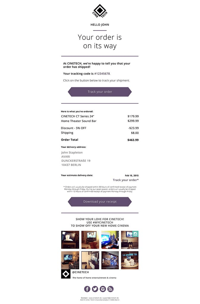
CineTech asks customers to show their love for the brand by taking a picture of their new home cinemas and sharing it with a specialized hashtag.
Also, there’s an option to download and print the receipt, which has nothing to do with UGC, but it is still very convenient.
Testimonials add-on for X-Cart allows customers to leave reviews about your products or services.
Price: $50
6. Nordstrom Designs Emails With a Mobile-First Mindset
If you want your order confirmation emails to produce additional revenue, you should no longer ignore mobiles and tablets.
The latest statistics from Campaign Monitor shows that 41% of opens now happen on mobile devices. That said, Apple iPhone is the most common device your customers use to read your transactional emails.
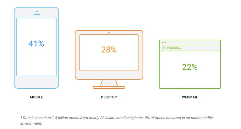
Surprised? It’s been ages since Google started prioritizing ‘mobile-friendly’ eCommerce sites in search results.
That’s why responsive email design is no longer a luxury, but a necessity. With customers spending more and more time on cell phones, you need to direct your attention to mobile marketing.
The good news is that you do not have to spend extra time and energy coding responsive order confirmation templates and mobile-ready landing pages that adapt to the various device sizes.
There is a wide variety of email builders who have already done that job for you. With the help of the following add-ons, you can quickly optimize your transactional emails for mobile in just a few clicks:
Sailthru app works with X-Cart via Segment. It provides you with the tools to engage with your shoppers via email, web, and mobile.
Price: Free
Blueshift app for X-Cart will let you trigger email campaigns, mobile push notifications, and SMS messages.
Price: Free
Selligent App for X-Cart will let you send triggered messages across email, web, mobile, offline, and more.
Price: Free
Remember to check the way your order confirmation notifications look on mobile devices. Some apps, like Mailchimp, allow you to send test emails. If your app does not have such functionality, no worries, just place a test order and refresh your inbox.
Nordstrom’s confirmation emails look good on both desktop computers and mobile devices. See below:
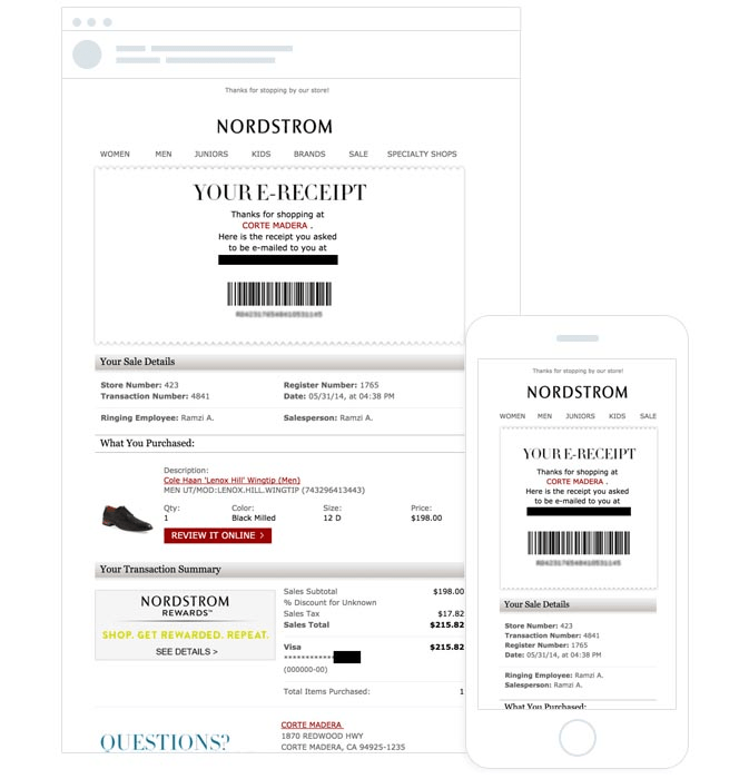
The order details are distinctly seen both on mobile and on desktop devices.
7. Parabo And Zulily Offer Order Tracking Options
Including tracking information in your order confirmation emails is one of the most effective ways to improve post-purchase customer experience.
Tracking info makes your transactional emails even more valuable as it stimulates your customers to open your email over and over again. Everyone is eager to find out where their parcel is, after all.
Parabo Press sends its customers a tracking link and suggests that you should click (and then re-click obsessively!) on it to track your package as it moves steadily in your direction. Plus, they display the exact delivery date.
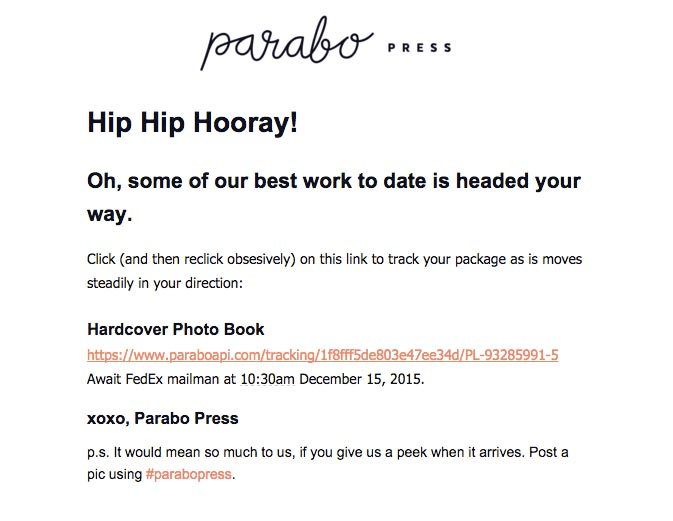
By the way, they miss no opportunity to get user-generated content, kindly asking their users to give them a peek when the item arrives.
Zulily order confirmation notification also provides users with shipping information and a tracking number. This way, they reassure customers that their parcel is already on its way to their doorstep.

8. TOMS Gives A Shoutout for “Being Part of the Movement”
Footwear retailer TOMS uses transactional emails to pursue global goals. Every purchase made through their eCommerce website helps provide shoes and social services to people in need. Conveying this important message through transactional emails, TOMS makes you feel like your purchase is supporting something that really matters.
Have a look at TOMS’ order confirmation notification below:
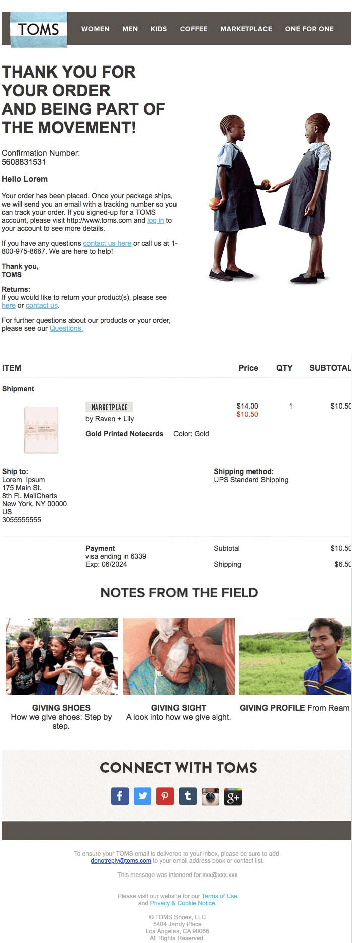
With TOMS, you kill two birds with one stone — you enjoy shopping online and help people living in developing countries. No upsell, no extra call to actions. Just a simple ‘Thank you’ note for being a part of their movement. Would you be proud of yourself for buying TOMS? I would.
9. REI and Dollar Shave Club Invite Users to Become a Member
Shoppers crave joining exclusive groups as much as they crave discounts. That’s probably why membership programs are among the best ways to monetize your eCommerce store.
Paid Memberships addon for X-Cart will let you sell premium memberships in your store.
Price: $69
Wholesale addon for X-Cart will enable you to set prices that depend on customers’ membership level.
Price: Free
The good news is that you can use your order confirmation emails to put this idea into practice. Plus, you can get additional revenue without very much extra work.
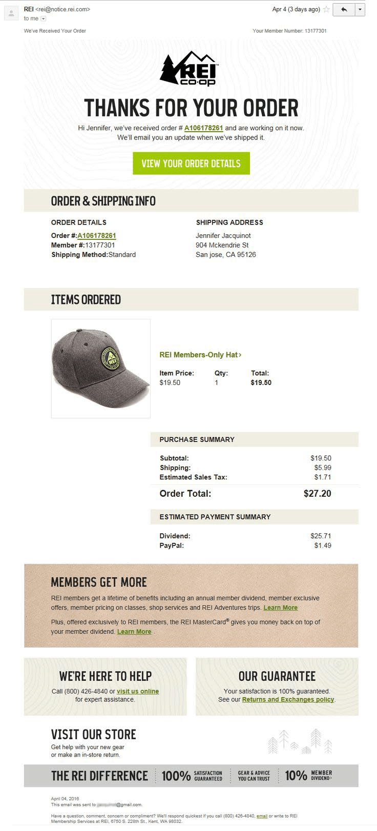
Have a look at the way REI invites shoppers to their club. These guys know a thing or two about the way purchase decisions are made.
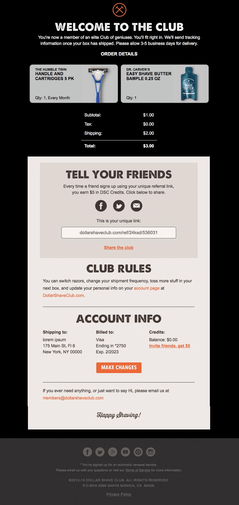
The dudes at Dollar Shave Club create an atmosphere of unity in their order confirmation notifications. They even have the club rules.
Check out the example below:
Below are a couple of tips that should help you add a membership program into your order confirmation emails:
- Focus on long-term benefits, not only on instant gratification to stimulate future purchases.
- Think of the reason for becoming a member. What might get your shoppers interested and keep them inside the club for a while?
- Reassure customers that they are a VIP by giving personalized recommendations.
- Place your offer at the bottom of your transactional emails, not at the top.
- Do not forget about the subject line — it should reflect the contents.
10. Gilt Offers Free Shipping for Any Order Made Within an Hour
Free shipping is enticing. Consider offering free shipping for:
- Orders above a certain sum;
- Sharing feedback with friends on social media;
- Purchasing an additional item;
- Taking part in a loyalty or referral program;
You could even offer free shipping on all the eCommerce products, regardless of the order subtotal as gifts.
Gilt offers free shipping for an hour, which means all the items you purchase within the next 60 minutes will be shipped for free. Take a look at Gilt’s order confirmation email below.

To make the shopping process even more convenient, Gilt includes images of recommended products at the bottom of the email.
Oh.. Wait! Some of these items are discounted by 80%, which makes the free shipping offer even more alluring.
Hidden coupons addon for X-Cart will allow you to insert hidden coupons on checkout, order confirmation, and invoice pages.
Price: $40
All these email marketing strategies bring additional revenue and stimulate future purchases.
11. Tradecy Invites Subscribers to Take Part in Referral Program
A referral marketing strategy is a time-tested and never-failing way to engage customers, drive advocacy, and growth.
To create a referral program that does the hard work for you, it’s important to include a personalized message in your order confirmation email that incentivizes your customers to share their feedback with their friends.
If you sell your products on Amazon, you may find this tool to be quite useful as you harness the power of feedback and build your reputation.
Here are a couple of examples of referral marketing:
- “Send the link to your friend and get $10 for your next order.”
- “Invite three people and get unlimited access to the extra features.”
Below you’ll find an excellent example of a transactional email with a referral program from Tradesy.
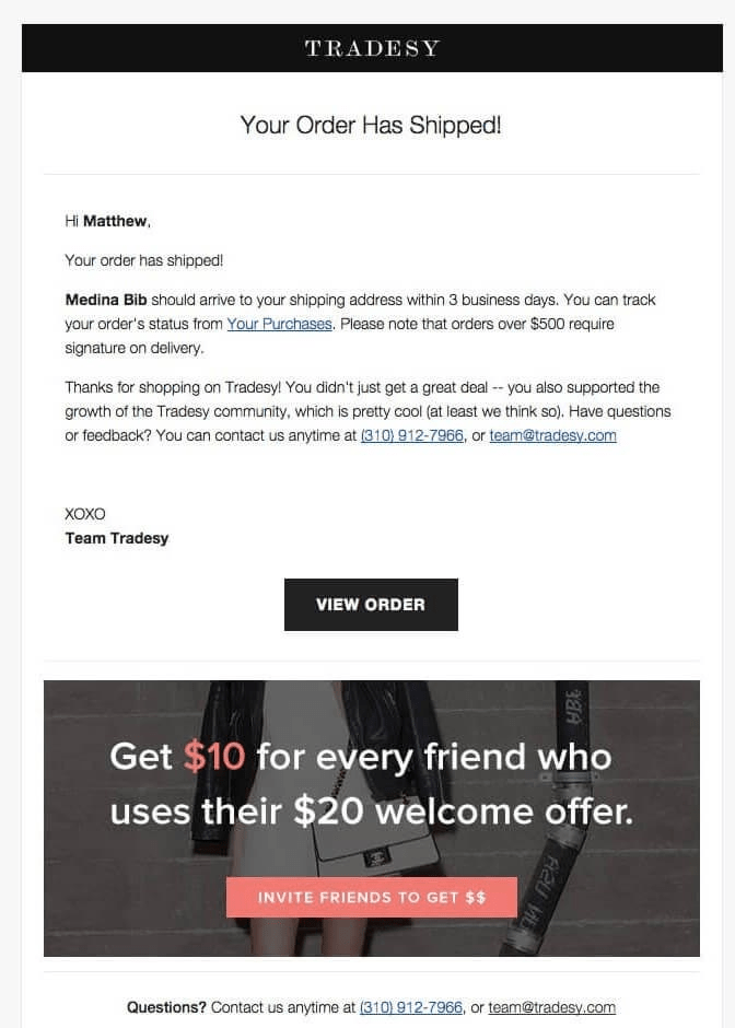
As you can see, there is a huge banner promoting Tradesy’s referral program. By offering $10 to their brand ambassadors and $20 to new users, they increase brand awareness and stimulate future purchases.

Partner program will let you increase your revenue rewarding your long-term buyers for recommending your store to their friends.
Price: $299.99
12. Backcountry Puts a Premium on Customer Support
Great order confirmation emails give buyers everything they need to know about their purchase. However, many shoppers still like to talk to a real person. That’s why adding a direct link to your customer support service in your order confirmation notifications may be a good idea.
As shown in the example below, Backcountry offers proactive customer service help to their customers before they ask for help.
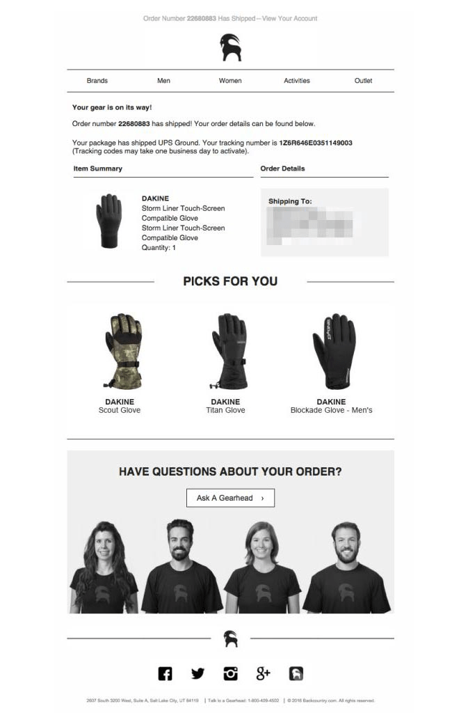
There’s an option to contact their customer care service, a direct phone number, and even pictures of their staff members. Providing a direct link to your customer support service will hardly drive more revenue to your eCommerce business, but it will definitely improve customer experience and help you reduce chargebacks.
13. Expressionery Invites Users to Join Their Facebook Page
Email marketing boasts some impressive statistics, with an ROI of over 3800% (DMA).
For example, according to (Artillery), email marketing is 40 times more effective than social media in terms of lead generation and overall conversion rates.
In addition, the average order value of an email is at least three times higher than that of social media (McKinsey).
However, social media is still your customers’ preferred communication tool, so you should not get rid of it. Instead, leverage the power of order confirmation emails to direct an incredible amount of traffic to your social media groups.
See how Expressionery uses confirmation emails to broaden its social media community.
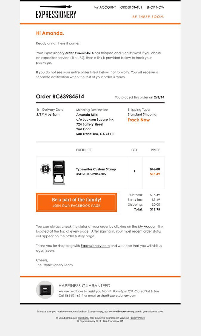
And it looks like this email strategy works — they have more than 16K followers on Facebook.
14. MOO Offers a Downloadable Receipt
The Little MOO, a friendly robot that manages orders for MOO’s customers, provides two ways to view customer history, including downloading and printing the receipt and logging in to the account to view details. Their confirmation email allows you to do both in only a few clicks.

15. Warby Parker Uses Detailed Product Photos
Warby Parker uses fantastic-looking product images in their emails to let customers see the details online before they see them in real life.

Additional resources:
Product Photography Tips From 19 Pros: How To Take Product Photos
16. Fat Brain Toys Shows What to Expect
This order confirmation email might seem too extravagant. Still, it has all the info customers may need, such as shipping and billing address, order number, and the like.
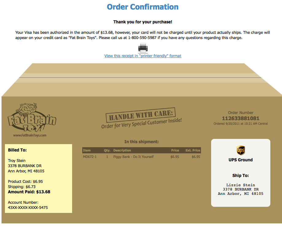
Plus, there’s an opportunity to view the receipt in the ‘printer-friendly’ format.
PDF invoices addon for X-Cart will automatically send the PDF invoice to a customer upon purchase in the order confirmation message.
Price: $49
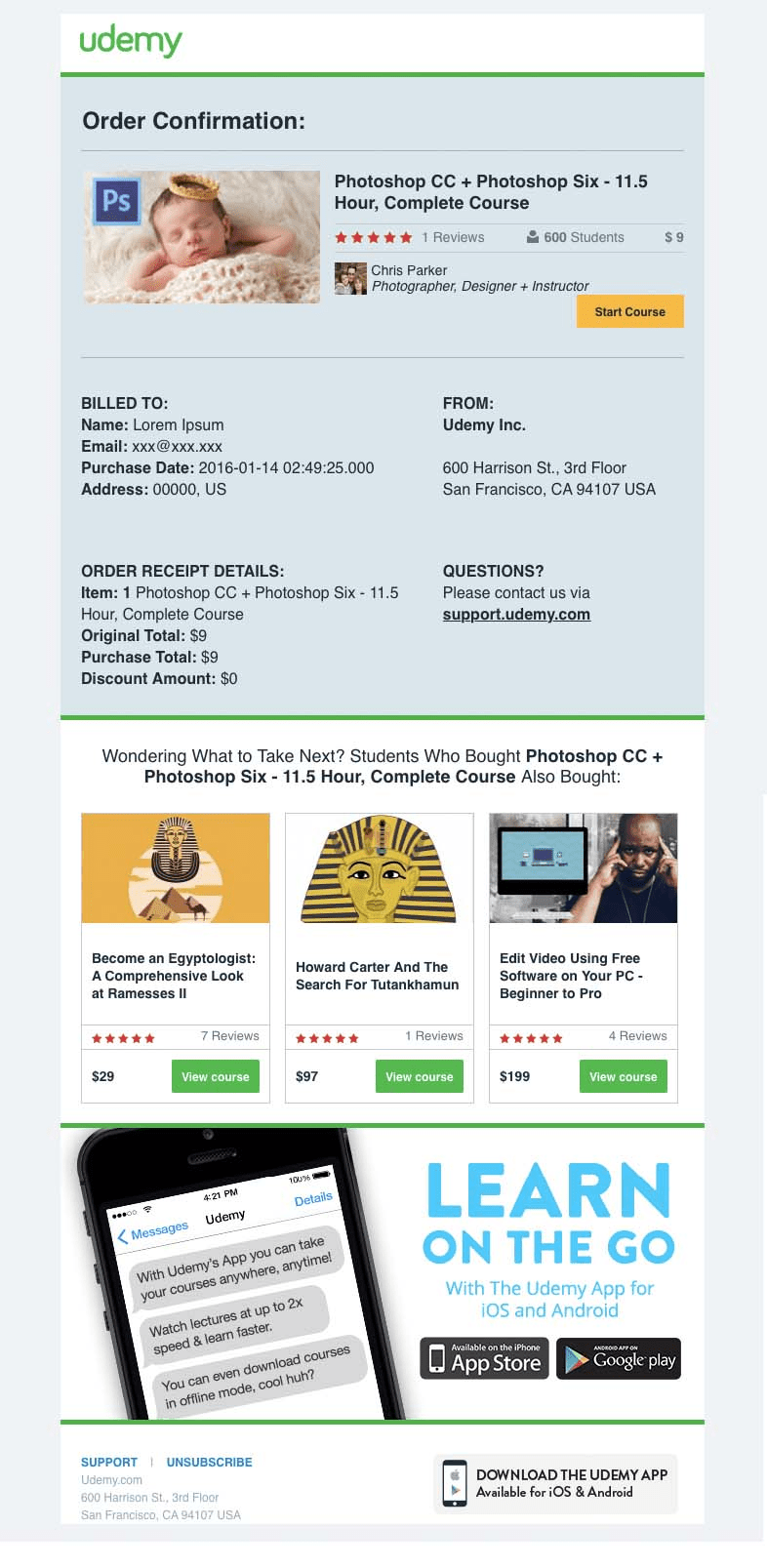
17. Udemy Provides Cross-Platform Experience
The guys from Udemy don’t waste their opportunity to have you use their apps for Android and iOS. Allowing customers to learn on the go, they boost retention and stimulate future sales.
Here’s the Bottom Line
Now that you’ve read the article down to the last word (Woo-hoo!), you should understand that order confirmation emails are all about creativity and function.
You can implement every single tip I’ve listed above, or you can boil your transactional email to just a simple “Thank you, Tom, for your order” note.
One way or another, this email receipt will appreciate your customers more than a generic (and offensively impersonal) “The order #1234 has been placed”.
What strategies do you use to enhance your order confirmation emails?
Feel free to share them in the comments below.
Chapters
About the author

